Executive Summary
The latest Prosper Insights & Technologies survey paints a clear picture of how Americans are feeling—and spending—as they head into the holiday season. While some demographic groups show resilience, overall financial sentiment remains cautious, shaped heavily by inflation, tariffs, and uncertainty about the broader economy. Key findings include
- Only 22% of consumers feel better off financially than last year, while 32% feel worse off, a net decline that closely mirrors consumer confidence trends.
- Gen Z, Millennials, married adults, parents, full-time workers, and higher earners are far more likely to report being better off. Women, Boomers, retirees, and the unemployed report the opposite.
- Consumers overwhelmingly cite inflation, tariffs, and government spending as the biggest threats to the economy. Rising prices are most noticeable in groceries, dining out, and electricity.
- Most believe they will pay more for groceries, clothing, and electronics due to tariffs, and overwhelmingly say U.S. consumers are the ones who ultimately bear the cost.
- About half plan to stick to their holiday budget, while those spending more want to make the season “extra special.” Those spending less cite less money, budget consciousness, and economic worries.
Americans Feel the Holiday Spending Squeeze
By Dr. Martin Block, Professor Emeritus, Northwestern University, Retail Analytics Council
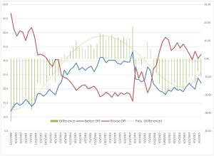
Every quarter, Prosper Technologies and Insights asks the question about personal financial situations in its monthly survey. The most recent November 2025 (n=8000) indicates that 22.1% of respondents indicate they are better off financially than a year ago, 45.7% are the same, and 32.2% are worse off. To facilitate comparison of the financial situation judgment, the difference between better and worse off will be used, in this case, a deficit of -10.2%. As shown in Figure 1, the difference can be used to understand the historical context. The difference represented by columns on the chart can be explained by a fourth-order polynomial (R2 = 0.92) shown as the green curve. The relative well-being was low until 2014, rose between 2015 and 2020, only to fall again after that.
Figure 1: Personal Financial Situation History
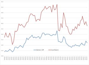
The personal financial situation correlates strongly with the Prosper measure of consumer confidence, with a correlation coefficient of 0.92, as shown in Figure 2. The personal financial situation provides a more relevant measure.
Figure 2: Prosper Consumer Confidence and Personal Financial Situation
Consumer sentiment is also measured periodically by the University of Michigan Consumer Sentiment and can be compared to Prosper consumer confidence, as shown in Figure 3. Time periods include only those for which both datasets are available. The correlation is 0.85, indicating strong consistency between the two measures.
Figure 3: Prosper Consumer Confidence vs Michigan Consumer Sentiment

Consumer Characteristics
Being married and having children are both strongly associated with financial well-being, as shown in Table 1. Being worse off is associated with being divorced or separated and being female. Income is also a strong predictor, with those being better off reporting $29,000 more per year than those being worse off. Respondents reporting being better off are younger by an average of 5.3 years.
Comparisons can also be made by generations. The generations are defined as Gen Z (18 to 28), Millennials (29 to 44), Gen X (45 to 60), Boomers (61 to 79) and Seniors (80+). Table 2 shows that Gen Z and Millennials are more likely to report being better off, while Boomers are the opposite.
Table 1: Financial Situation by Demographics (Percents)
| Better off | Same | Worse off | Total | Difference | |
| Married | 46.6 | 39.7 | 31.8 | 38.6 | 14.8 |
| Living with Unmarried Partner | 7.9 | 6.9 | 8.9 | 7.8 | -1.0 |
| Divorced or separated | 7.3 | 11.2 | 13.0 | 10.8 | -5.7 |
| Widowed | 3.1 | 5.0 | 6.3 | 5.0 | -3.2 |
| Single, never married | 29.6 | 31.2 | 33.3 | 31.4 | -3.7 |
| Have Children | 46.8 | 33.4 | 32.1 | 36.2 | 14.7 |
| Male | 58.5 | 48.4 | 38.9 | 47.6 | 19.6 |
| Female | 41.5 | 51.6 | 61.1 | 52.4 | -19.6 |
| Age (Years) | 43.3 | 49.3 | 48.6 | 47.7 | -5.3 |
| Income ($) | 79.9 | 68.1 | 51.0 | 65.0 | 29.0 |
Table 2: Financial Situation by Generation (Percents)
| Better off | Same | Worse off | Total | Difference | |
| Gen Z | 25.0 | 18.1 | 19.2 | 20.1 | 5.8 |
| Millennials | 30.5 | 24.1 | 23.8 | 25.5 | 6.7 |
| Gen X | 25.3 | 27.2 | 28.0 | 27.1 | -2.7 |
| Boomers | 17.9 | 27.6 | 27.8 | 25.3 | -9.9 |
| Seniors | 1.3 | 3.0 | 1.3 | 2.0 | 0.0 |
With respect to occupation, professionals and business owners are most likely to report being better off, as shown in Table 3. Those who report being worse off include retired, unemployed and disabled
Table 3: Financial Situation by Occupation (Percents)
| Better off | Same | Worse off | Total | Difference | |
| Business Owner | 11.10 | 5.50 | 4.40 | 6.40 | 6.70 |
| Professional/Managerial | 28.00 | 19.60 | 13.40 | 19.40 | 14.60 |
| Salesperson | 3.90 | 3.70 | 3.70 | 3.80 | 0.20 |
| Factory worker/Laborer/Driver | 5.60 | 5.20 | 4.50 | 5.10 | 1.10 |
| Clerical or Service Worker | 7.80 | 9.70 | 8.80 | 9.00 | -1.00 |
| Stay-at-home parent | 5.00 | 6.10 | 5.60 | 5.70 | -0.60 |
| Student, High School or College | 7.40 | 5.40 | 5.70 | 6.10 | 1.70 |
| Military | 1.10 | 0.90 | 1.20 | 1.10 | -0.10 |
| Retired | 13.40 | 22.70 | 19.80 | 19.50 | -6.40 |
| Unemployed | 5.80 | 9.20 | 14.50 | 10.10 | -8.70 |
| Disabled (Unable to work) | 2.50 | 4.70 | 8.90 | 5.60 | -6.40 |
Those who are employed full-time report being nearly twice as likely to be better off, as shown in Table 4. Those unemployed and looking for work are the opposite.
Table 4: Financial Situation by Employment Status (Percents)
| Better off | Same | Worse off | Total | Difference | |
| Employed full-time | 49.9 | 35.4 | 27.9 | 36.1 | 22.0 |
| Employed part-time | 10.1 | 9.5 | 9.7 | 9.8 | 0.4 |
| Self-employed | 7.1 | 6.3 | 5.6 | 6.2 | 1.5 |
| Stay-at-home parent | 4.9 | 6.1 | 7.3 | 6.3 | -2.4 |
| Unemployed, looking for work | 4.6 | 7.1 | 13.0 | 8.4 | -8.4 |
| Unemployed, not looking for work | 2.4 | 3.9 | 4.8 | 3.9 | -2.4 |
| Other | 0.7 | 1.6 | 3.4 | 2.0 | -2.7 |
In general, older generations report having more investments, as shown in Table 5. An exception can be seen in crypto and gold, which are more common among younger generations. In every case, a savings account is the leading form of investment. Table 6 shows ownership of a retirement account. The percentage either not answering or reporting zero is subtracted from 100%. The percentage with retirement accounts steadily increases with the age of the generations, as do the median reported balances.
Table 5: Investments by Generation (Percents)
| Gen Z | Millennials | Gen X | Boomers | Seniors | Total | |
| Savings account | 26.2 | 33.1 | 40.8 | 50.6 | 58.4 | 38.7 |
| Individual Retirement Account (IRA) | 11.6 | 18.7 | 24.9 | 37.5 | 44.1 | 24.2 |
| Company sponsored 401(k) or 403(b) | 13.7 | 26.2 | 31.0 | 18.1 | 6.8 | 22.5 |
| Life Insurance | 11.7 | 18.3 | 23.3 | 26.9 | 26.1 | 20.7 |
| Stocks in companies | 9.9 | 14.3 | 20.0 | 24.6 | 34.2 | 17.9 |
| Mutual fund investments | 7.0 | 10.9 | 16.2 | 23.8 | 31.1 | 15.2 |
| CDs | 5.7 | 9.4 | 14.0 | 26.1 | 39.1 | 14.7 |
| Money market account | 7.1 | 11.9 | 14.1 | 22.6 | 29.8 | 14.6 |
| Bonds | 6.0 | 11.5 | 10.9 | 15.7 | 24.8 | 11.6 |
| Crypto | 12.4 | 14.4 | 9.0 | 3.6 | 1.9 | 9.5 |
| Annuities | 3.3 | 7.3 | 7.1 | 16.3 | 26.1 | 9.1 |
| Gold | 6.8 | 8.1 | 6.0 | 3.9 | 5.6 | 6.1 |
| Treasury Bills | 1.1 | 2.1 | 2.6 | 4.6 | 9.9 | 2.8 |
| None of the above | 36.1 | 29.1 | 28.7 | 23.8 | 18.0 | 28.8 |
Table 6: Retirement Accounts by Generation
| Percent Having | Median Amount | |
| All Adults | 62.6 | 75,000 |
| GenZ | 52.8 | 35,000 |
| Millennial | 63.5 | 75,000 |
| GenX | 65.2 | 125,000 |
| Boomer | 71.4 | 225,000 |
| Senior | 76.9 | 425,000 |
Happiness by generation is shown in Table 7. Happiness is measured on a 5-point scale across ten items. Very happy and happy are combined to yield the percentages shown. Composite happiness is the average of 10 individual scales. Happiness increases among the older generations, whereas the financial situation, as previously shown in Table 2, moves in the opposite direction.
Table 7: Happiness on Ten Life Conditions by Generation (Percent Very or Somewhat Happy)
| Gen Z | Millennials | Gen X | Boomers | Seniors | Total | |
| Health | 43.9 | 52.0 | 55.2 | 60.1 | 65.8 | 53.6 |
| Family | 49.5 | 58.3 | 65.8 | 74.1 | 86.3 | 63.1 |
| Friends | 47.7 | 54.5 | 62.1 | 72.7 | 83.2 | 60.4 |
| Love | 42.9 | 52.3 | 53.9 | 52.6 | 50.9 | 50.9 |
| Home | 49.0 | 57.0 | 64.0 | 74.0 | 80.1 | 62.0 |
| Religion | 46.9 | 53.7 | 57.6 | 62.1 | 64.6 | 55.7 |
| Work | 35.5 | 43.6 | 48.1 | 42.5 | 27.3 | 42.6 |
| House | 44.5 | 54.0 | 61.1 | 73.5 | 79.5 | 59.5 |
| Neighborhood | 43.6 | 53.7 | 58.2 | 69.4 | 82.0 | 57.5 |
| Government | 25.7 | 29.9 | 26.3 | 21.0 | 17.4 | 25.6 |
| Composite of All | 42.9 | 50.9 | 55.2 | 60.2 | 63.7 | 53.1 |
Reported political party shows a dramatic difference in the financial situation as shown in Table 8. Republicans are considerably more likely to report being better off than Democrats.
Table 8: Financial Situation by Political Party (Percents)
| Better off | Same | Worse off | Total | Difference | |
| Republican | 44.30 | 34.60 | 23.30 | 33.30 | 21.00 |
| Democrat | 32.80 | 37.30 | 45.20 | 38.70 | -12.40 |
| Independent | 20.60 | 24.30 | 26.30 | 24.10 | -5.70 |
| Libertarian | 0.40 | 1.10 | 0.90 | 0.90 | -0.50 |
A possible contributing factor may be the source of political news. In the annual MBI survey (n=17,654), the sources of political news were asked (February 2025). Note that this only represents an association: Republicans were more likely to watch Fox News and Newsmax, while Democrats were more likely to watch broadcast network TV news, MSNBC, and CNN.
Table 9: News Source by Political Party (Percents)
| Adults 18+ | Republican | Democrat | Difference | |
| Fox News | 21.4 | 40.4 | 12.6 | 27.8 |
| Newsmax | 5.8 | 10.7 | 3.3 | 7.4 |
| 9.3 | 13.0 | 7.7 | 5.3 | |
| Family and Friends | 17.7 | 20.9 | 17.4 | 3.5 |
| Talk Radio | 7.6 | 10.3 | 6.9 | 3.4 |
| 20.1 | 23.5 | 20.5 | 3.0 | |
| Magazines | 5.4 | 5.8 | 6.4 | -0.6 |
| Online News Websites | 19.3 | 19.1 | 22.9 | -3.7 |
| Political Comedy Shows | 5.3 | 4.1 | 8.1 | -4.0 |
| Newspaper | 11.9 | 11.8 | 16.4 | -4.6 |
| Broadcast TV News | 23.4 | 23.3 | 31.6 | -8.4 |
| MSNBC | 12.0 | 8.0 | 21.8 | -13.8 |
| CNN | 19.9 | 15.8 | 32.0 | -16.3 |
Economy, Inflation and Tariffs
More consumers seem to believe the economy is not on the right track, as shown in Table 10. Those disagreeing with the statement “the economy is on the right track” are about 50% higher than those agreeing.
Table 10: Believe the U.S. Economy is on the Right Track
| Percent | Agree/Disagree | |
| Strongly Agree | 12.9 | |
| Agree | 17.3 | 30.2 |
| Uncertain | 23.4 | 22.7 |
| Disagree | 15.6 | |
| Strongly Disagree | 30.8 | 46.4 |
The same pattern can be seen in Table 11, which shows confidence in a strong economy in the next six months.
Table 11: Chances for a Strong Economy in Next Six Months
| Percent | |
| Very confident | 14.9 |
| Confident | 22.4 |
| Little confidence | 36.5 |
| No confidence | 26.2 |
The primary reasons for a negative view of the future economy are shown in Table 12. Respondents could select multiple categories. The leading negative reasons are inflation, tariffs and government spending.
Table 12: Factors Having Negative Impact on Economy
| Percent | |
| Inflation | 53.2 |
| Tariffs | 49.1 |
| Government Spending | 40.8 |
| Social unrest | 23.7 |
| U.S-China relations | 22.8 |
| Crime | 18.5 |
| Covid-19 pandemic | 15.0 |
| The conflict in Ukraine | 14.6 |
| Israel-Hamas War | 14.1 |
| Mexico border control | 13.9 |
| Terrorism | 12.8 |
| Challenges facing certain U.S. banks | 10.9 |
| Iran Conflict | 7.8 |
| Other | 6.0 |
| None of the above | 10.5 |
With respect to inflation, the product categories where higher prices are most noticed are grocery, with meat and fresh produce at the top of the list, as shown in Table 13. Dining out is also high, followed by electricity.
Table 13: Noticed Higher Prices
| Percent | |
| Groceries – Meat/Poultry/Fish | 57.0 |
| Groceries – Fresh Produce | 51.0 |
| Groceries – Packaged Foods | 45.4 |
| Dining Out | 44.5 |
| Groceries – Frozen Foods | 44.3 |
| Utilities – Electricity | 36.8 |
| Gasoline | 33.6 |
| Apparel & Accessories | 32.0 |
| Health & Beauty Products | 31.4 |
| Insurance (Auto, Home, etc.) | 27.1 |
| Household Cleaning & Laundry Products | 27.0 |
| Heath Insurance | 25.7 |
| Utilities – Gas | 25.4 |
| Home Improvement Products | 24.8 |
| Property Taxes | 24.1 |
| Travel | 22.0 |
| Pet Supplies | 21.3 |
| Services – Internet Access | 21.3 |
| Services – TV & Video Entertainment | 20.2 |
| Prescriptions/Medicines | 19.5 |
| Home Decor | 18.5 |
| Rent | 18.5 |
| Services – Mobile Phone | 17.9 |
| Transportation | 17.6 |
| Linens/Bedding/Draperies | 17.2 |
| Utilities – Oil | 13.4 |
| Other | 1.1 |
| None of the above | 11.3 |
Regarding tariffs, 62.3% expect higher prices, while 23.5% are unsure. Table 14 shows that groceries again top the list. Clothing, computers and electronics follow close behind.
Table 14: Expect to Pay More Because of Tariffs
| Percent | |
| Groceries | 55.3 |
| Clothing | 47.9 |
| Computers & Electronics | 47.3 |
| Automobiles | 44.1 |
| Gas & Energy | 42.3 |
| Appliances | 37.7 |
| Dining Out | 37.5 |
| Home Improvement Products | 33.2 |
| Furniture | 30.9 |
| Alcoholic Beverages | 29.6 |
| Toys | 24.3 |
| Other | 4.6 |
The leading reason for higher prices, as shown in Table 15, is tariffs on imported goods. Just over one-third say that companies unfairly raise prices just because they can.
Table 15: Reasons for Higher Prices
| Percent | |
| Companies unfairly raise prices just because they can | 34.9 |
| Companies are raising prices because their costs for rent, labor and the supply chain have gone up | 42.1 |
| Low inventory | 15.1 |
| Tariffs on goods imported to the U.S. from other countries | 55.5 |
| Other | 3.0 |
| Don’t know | 13.9 |
Overwhelmingly, consumers say they are the ones who pay for and are hurt by tariffs, as shown in Table 16.
Table 16: Who Pays and is Hurt by Tariffs
| Pays for | Tariffs | |
| Tariffs | Hurt | |
| Foreign governments | 14.4 | 16.3 |
| Foreign manufacturers | 19.4 | 23.2 |
| U.S. businesses and manufacturers | 30.7 | 35.3 |
| U.S. Consumers | 54.7 | 58.9 |
| I don’t know | 18.0 | 16.1 |
Retail Spending
What consumers say they enjoy the most about the holiday season is shown in Table 17. At least two of the items, finding the perfect gift for someone and pop-up shops, directly relate to retail spending. The leading item is family tradition.
Table 17: Enjoy Most About the Holiday Season
| Percent | |
| Family tradition | 26.1 |
| The holiday decorations and displays | 18.7 |
| Finding the perfect gift for someone | 13.7 |
| It gets me in the holiday spirit | 10.5 |
| Social outing or group activity | 8.0 |
| Special holiday events or pop-up shops | 5.6 |
| The hustle and bustle | 4.9 |
| None of the above | 12.1 |
As previously discussed, about 50% of respondents plan to spend more than the budget than less, as shown in Table 18. Half say they plan to spend what they originally budgeted.
Table 18: Holiday Purchases Related to Budget
| Percent | |
| Significantly more | 10.2 |
| Somewhat more | 22.2 |
| I am expecting to spend what I originally budgeted | 49.0 |
| Somewhat less | 10.1 |
| Significantly less | 8.5 |
The reasons for spending more are shown in Table 19. The list is topped by trying to make the holiday extra special, which likely relates to the family tradition. The reasons to spend less are shown in Table 20, with having less money at the top of the list.
Table 19: Reasons to Spend More
| Percent | |
| I’m trying to make the holiday extra special this year | 13.7 |
| More people to buy gifts for | 9.4 |
| I expect prices on gifts and other holiday items will be higher this year | 8.5 |
| Have more money this year | 7.1 |
| Will be buying more overall because of retailer discounts | 7.0 |
| Shipping fees with increased online shopping | 5.8 |
| I expect to see fewer retailer discounts | 3.0 |
| Other | 0.3 |
| None of the above | 0.2 |
Table 20: Reasons to Spend Less
| Percent | |
| Have less money this year | 15.6 |
| Being more budget-conscious | 12.7 |
| Trying to save more money overall this year | 11.9 |
| Too worried about the state of the economy | 11.5 |
| Buying gifts for fewer people | 6.7 |
| Won’t be seeing family/friends this year | 2.8 |
| Expecting steeper retailer discounts this year | 1.9 |
| Other | 0.7 |
| None of the above | 0.4 |
The economy has influenced purchase behavior in the last six months, as shown in Table 21. Consumers say they are more focused on needs than on wants, are more practical and realistic, are budget-conscious, and eat at home more often. Political and security issues are mentioned by over one-fifth. Just over one-fifth say they have made no changes.
Table 21: Purchase Behavior in Last 6 Months
| Percent | |
| I focus more on what I NEED rather than what I WANT | 40.5 |
| I have become more practical and realistic in my purchases | 36.6 |
| I have become more budget-conscious | 29.5 |
| I am eating home-cooked meals more often | 26.9 |
| I worry more about political and national security issues | 22.2 |
| I worry more about my safety in public places | 17.9 |
| I am spending more time with my family | 15.2 |
| I am focusing more on experiences rather than buying stuff | 13.6 |
| I have reordered priorities in my daily life | 13.3 |
| I have become more conscious about food safety | 13.2 |
| I am shopping less at enclosed shopping malls and more at free standing stores | 9.6 |
| I am focusing more on buying local and/or from small businesses | 9.6 |
| I have become more environmentally responsible in my daily life | 7.1 |
| I am spending more time and money on decorating my home | 6.5 |
| I have become less practical and more impulsive in my purchases | 5.7 |
| I have not made any changes | 19.2 |
Several financial steps have been taken, led by decreasing overall spending as shown in Table 22. It is interesting that increasing savings and paying down debt are also reported steps. About 30% say they have taken no steps.
Table 22: Financial Steps Taken
| Percent | |
| Decrease overall spending | 28.6 |
| Increase savings | 26.8 |
| Pay down debt | 23.5 |
| Pay with cash more often | 14.2 |
| Buy Stocks | 12.0 |
| Sell Stocks | 7.8 |
| Refinance home | 3.8 |
| Buy home | 3.8 |
| Sell home | 2.4 |
| Other | 0.7 |
| None | 30.2 |
Summary
The results of the Prosper survey clearly show a more negative than positive overall view of the economy, with 22% of respondents saying they are better off financially and 32% saying they are worse off. Perceptions of one’s economic well-being closely track consumer confidence, which is slightly down. Being better off financially is more common among people who are married, have children, work in business or professional roles, are younger, and belong to Gen Z or the Millennial generation. Overall, more respondents report the economy is “not on the right track” compared to the opposite. The biggest economic concerns are inflation and the impact of tariffs. Inflation is most concerning for groceries, dining out and electricity.